A global rebranding focused on elevating historic visual elements
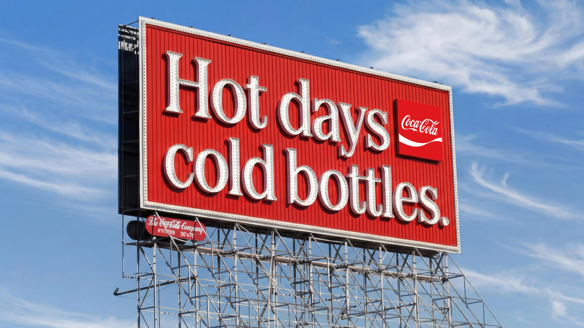
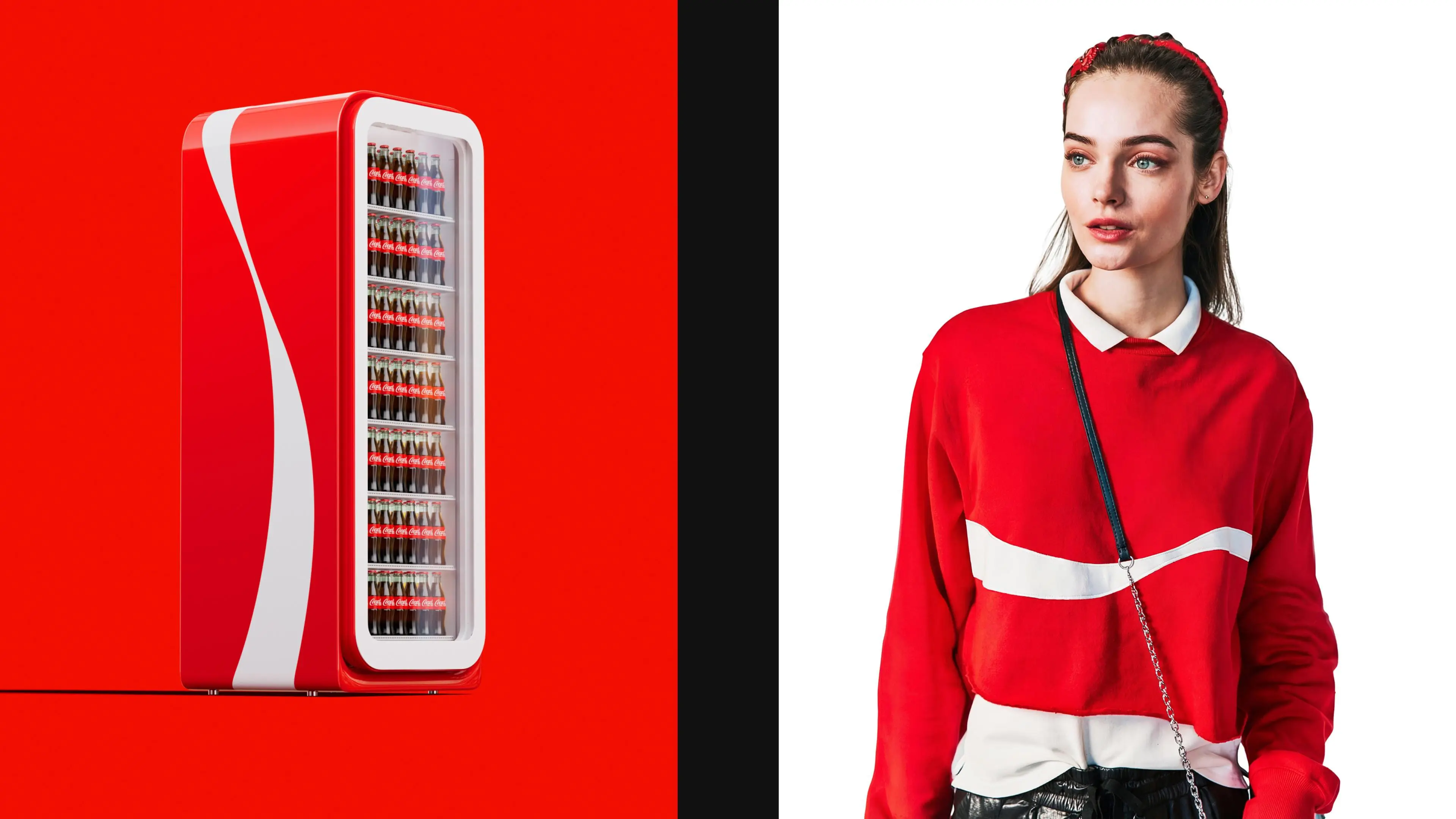
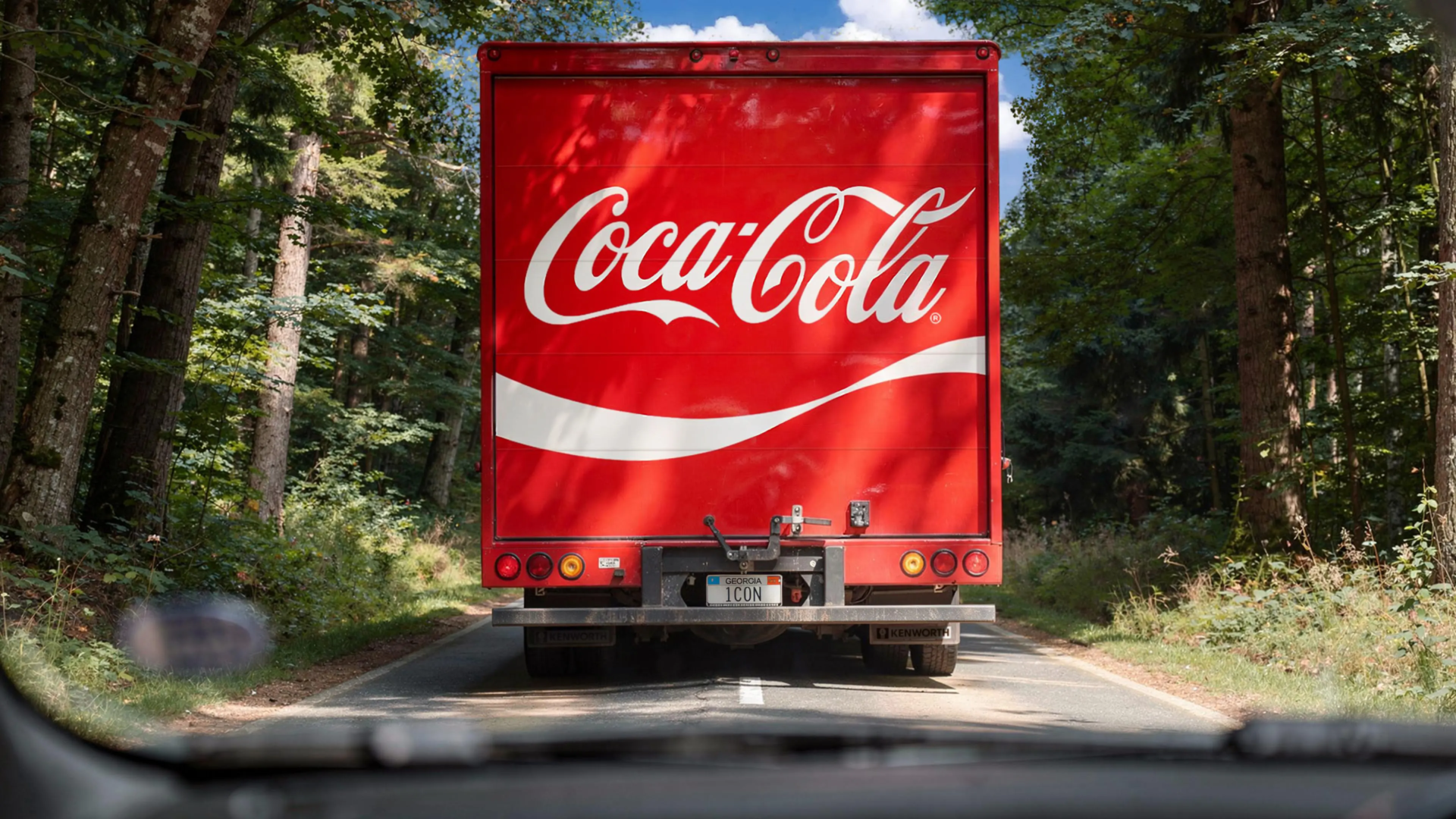
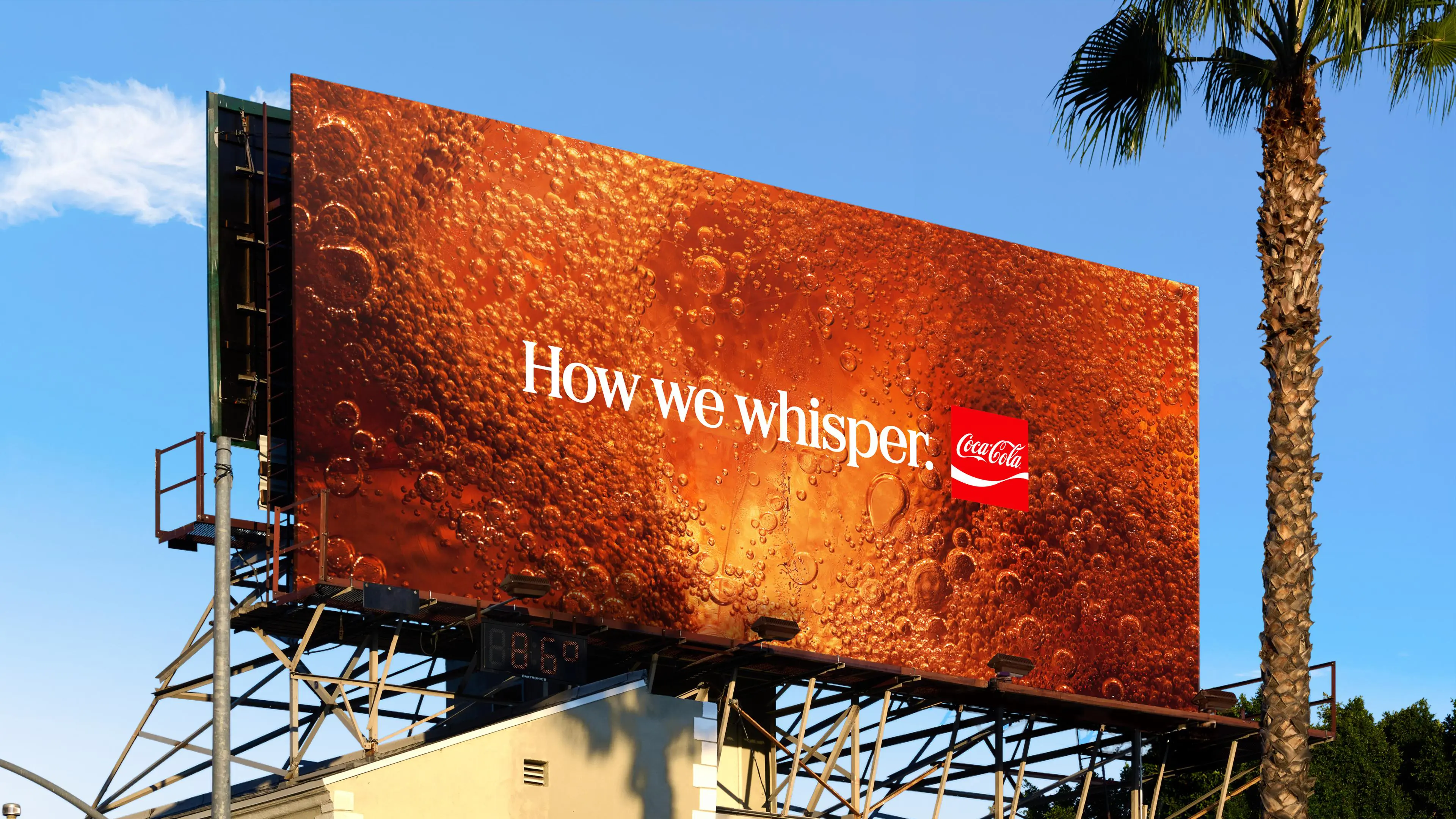
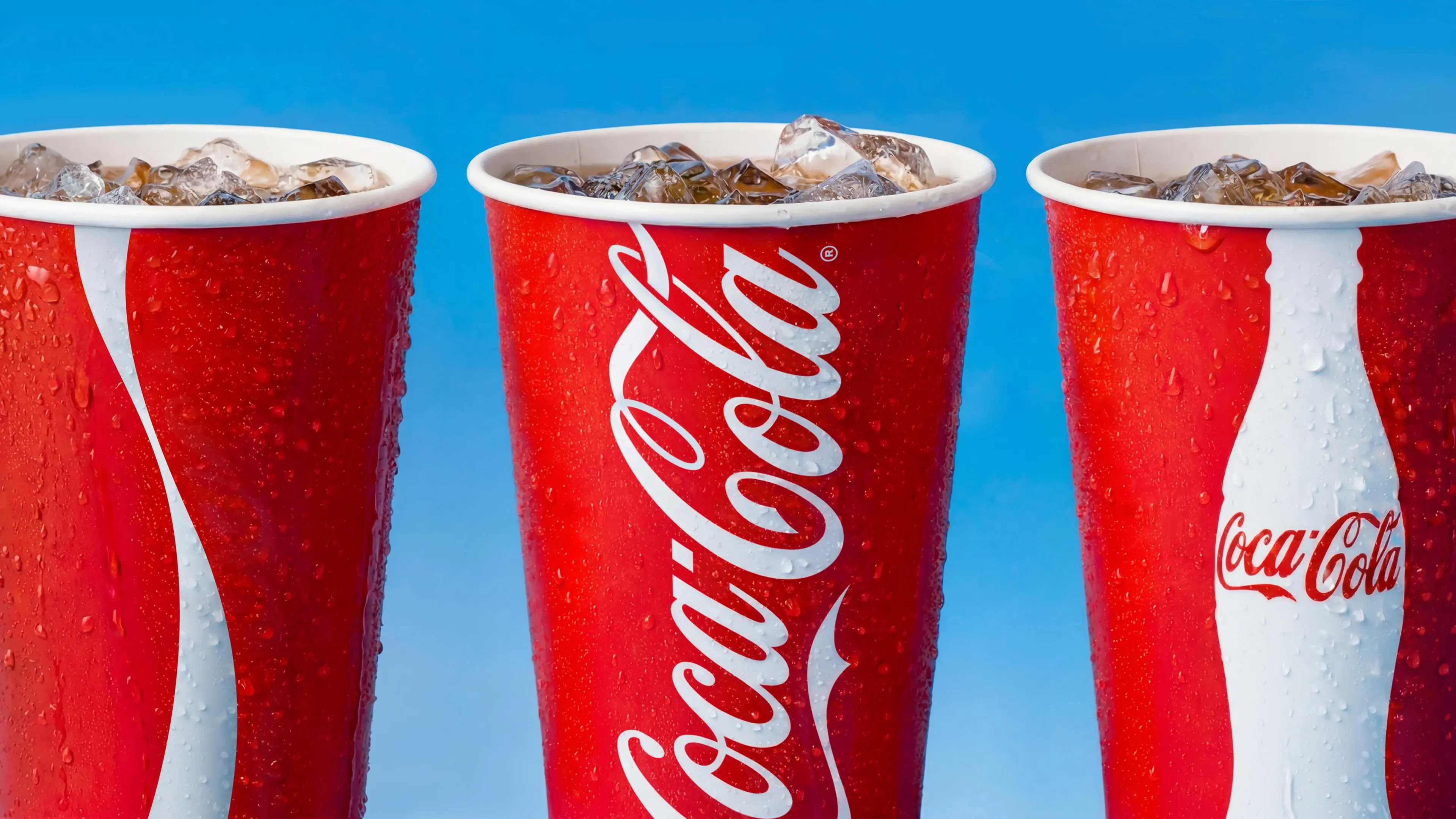
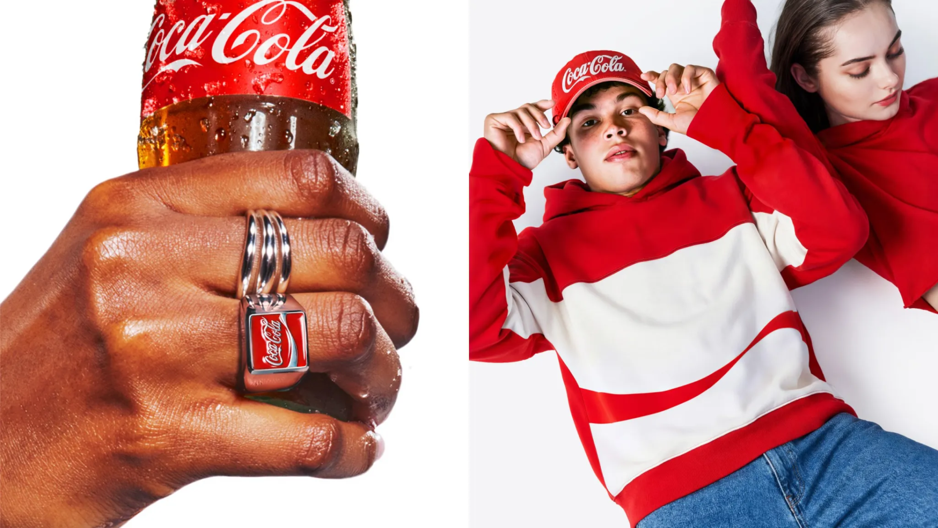
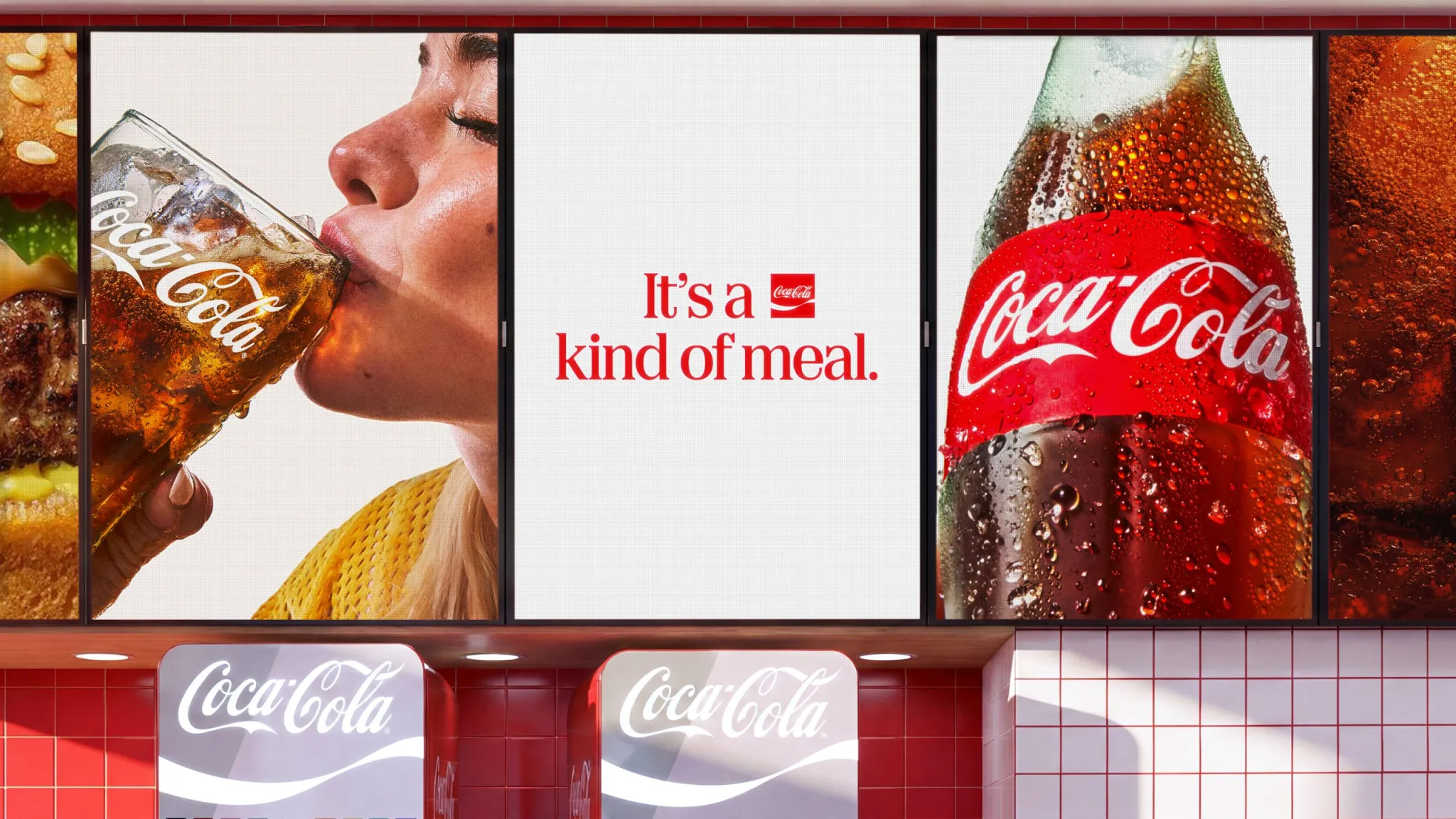
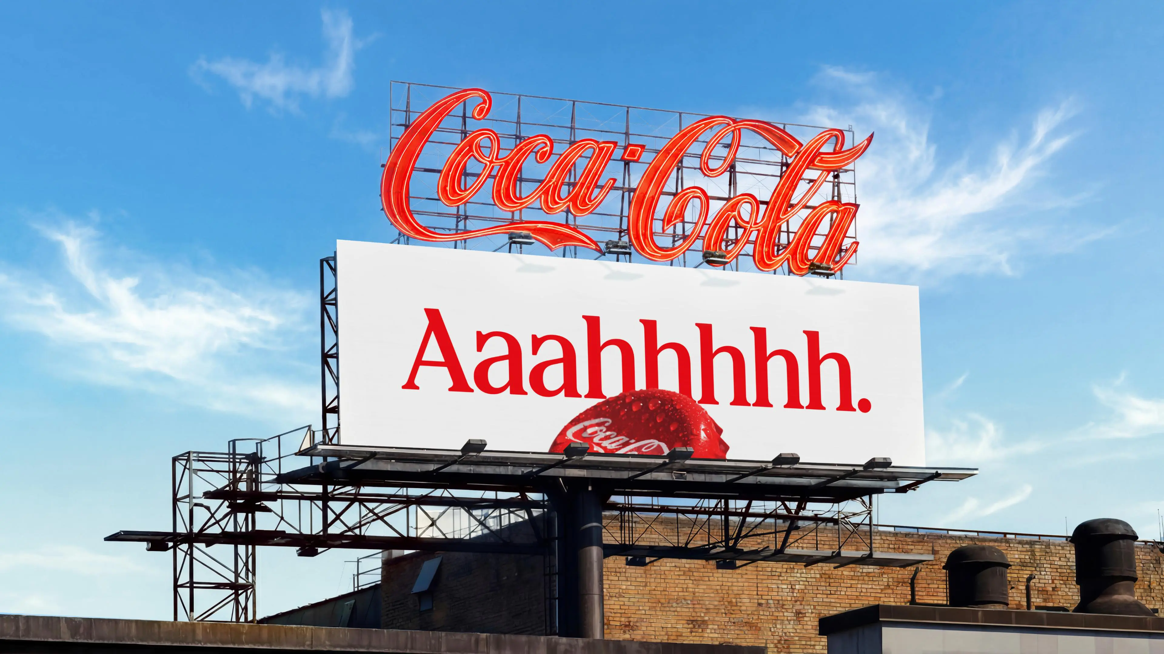
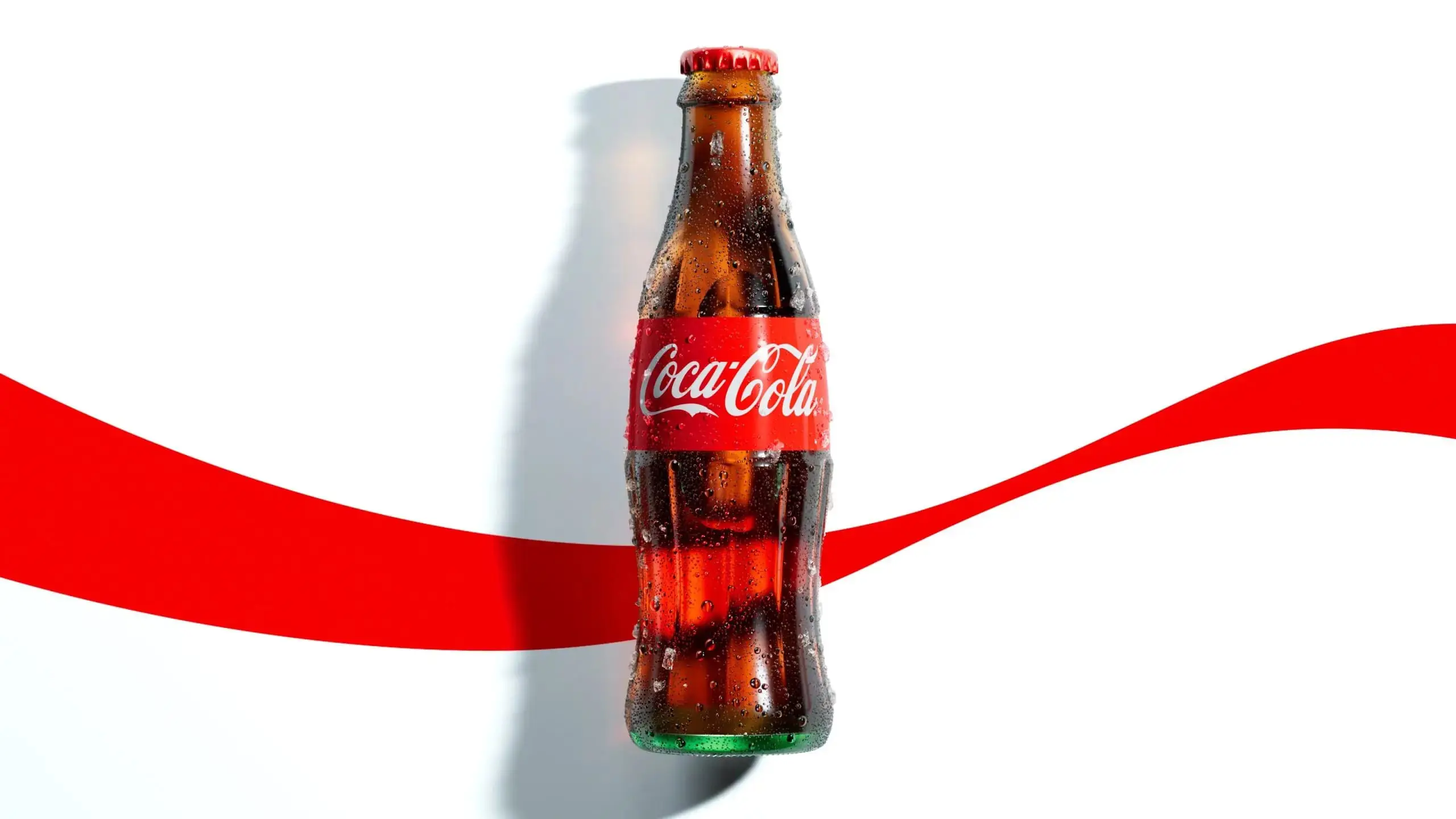
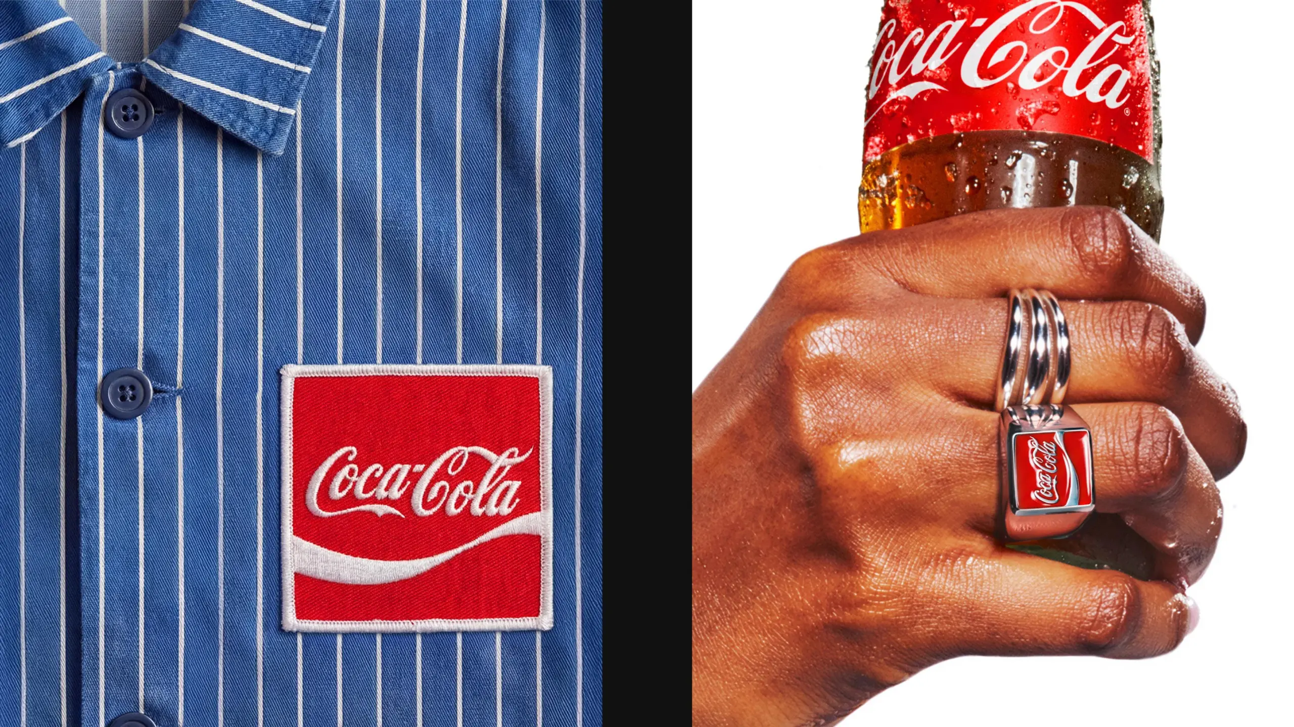
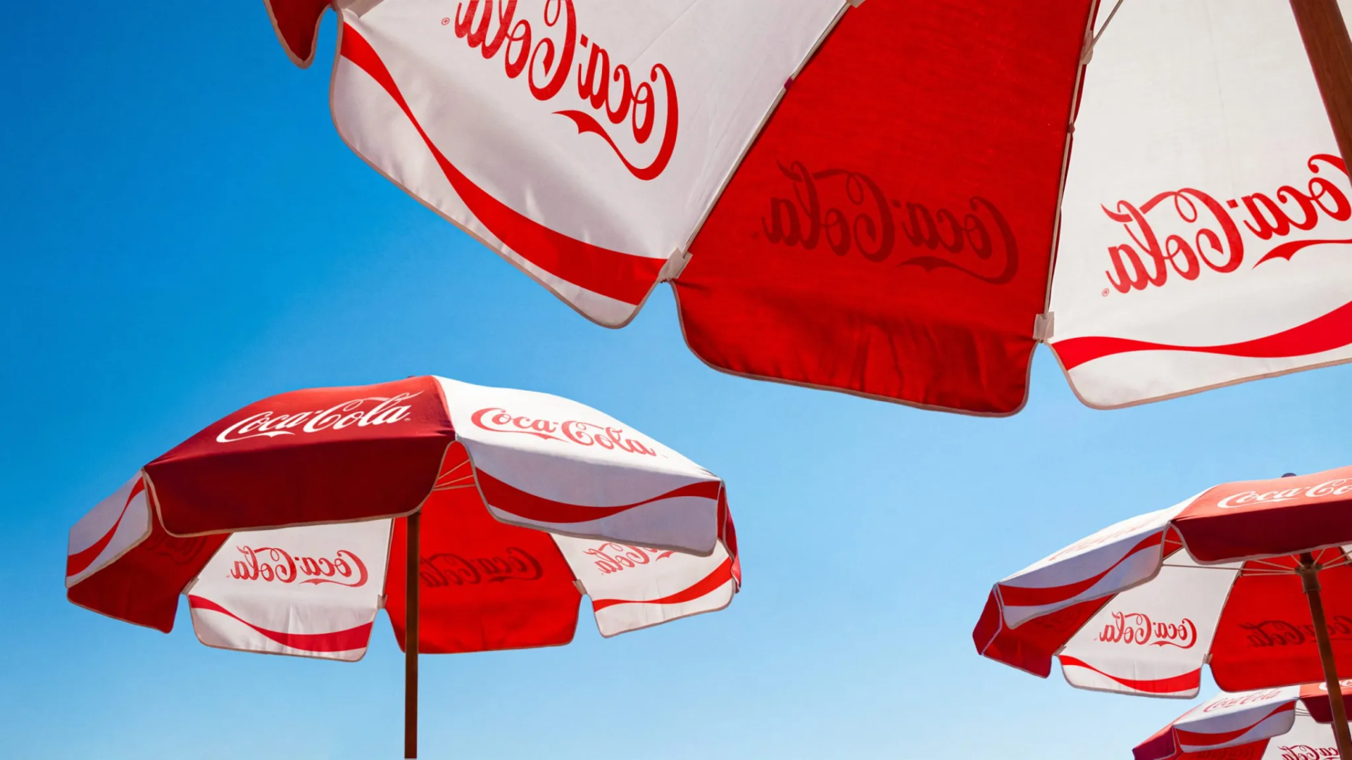
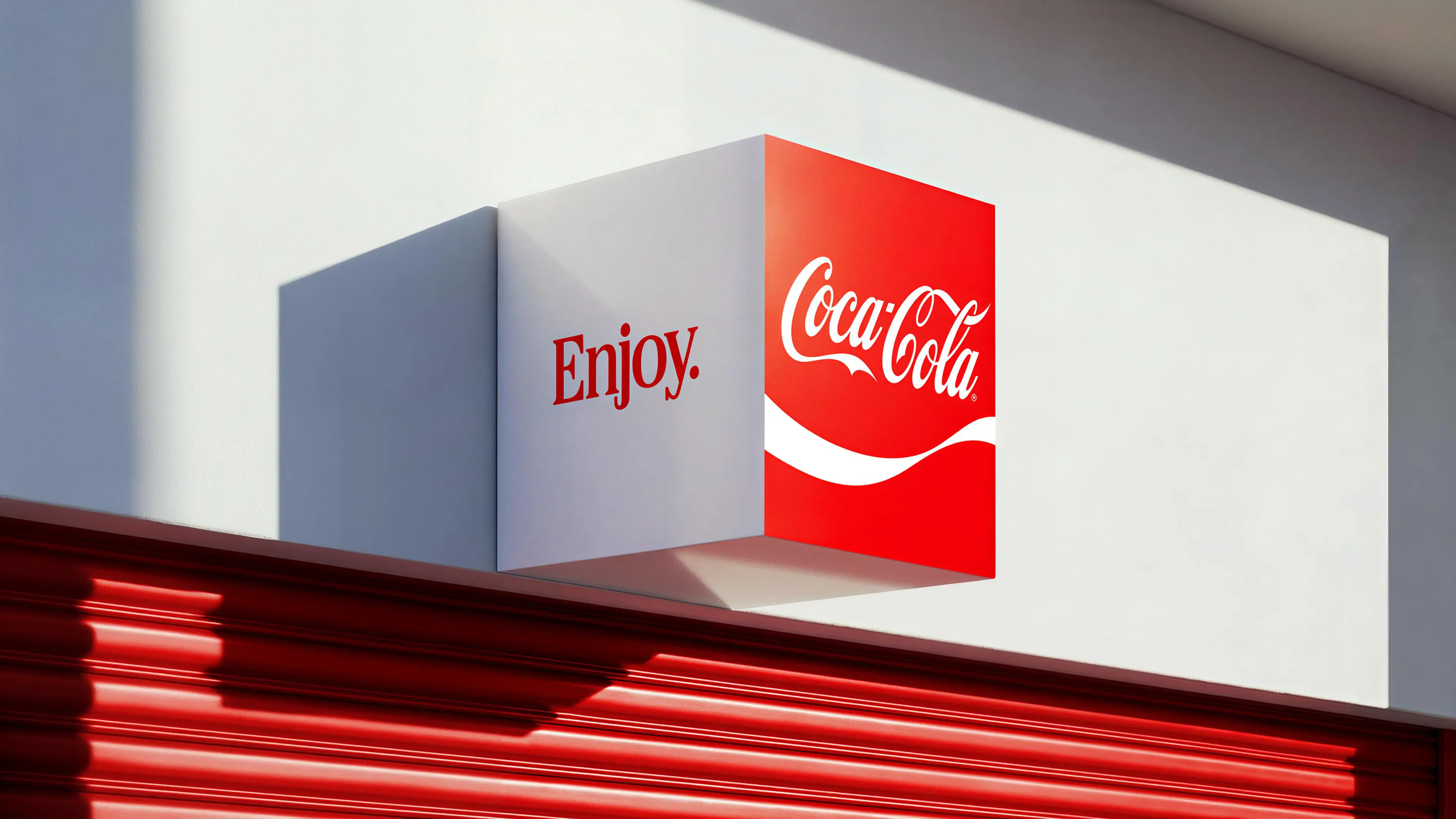
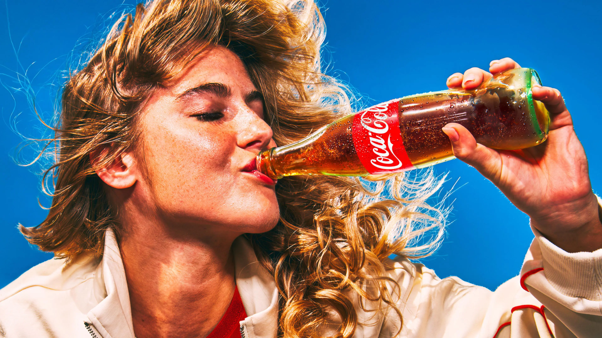
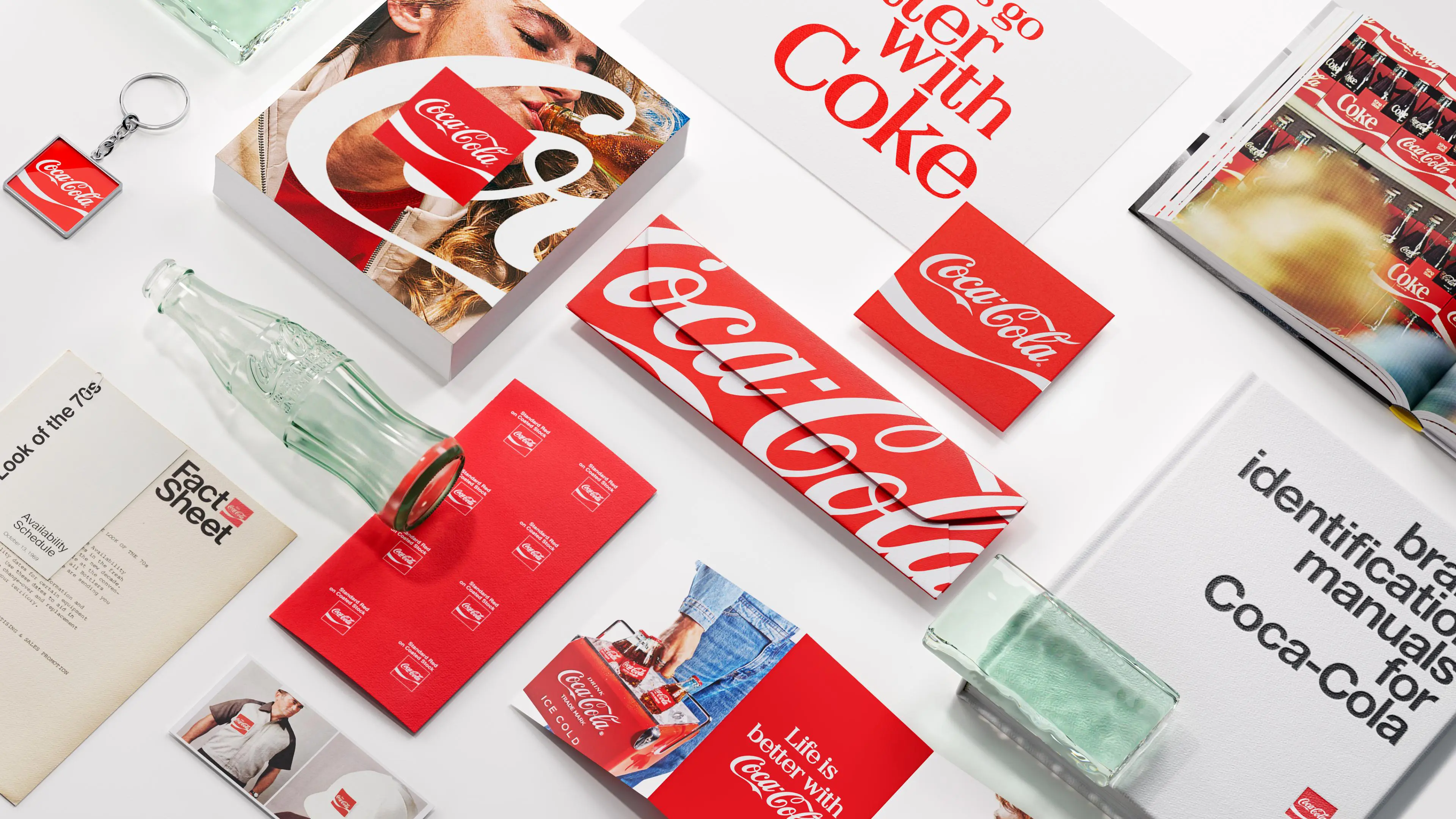
American giant Coca-Cola unveils a new visual identity deployed in over 200 countries worldwide. Developed by the agency JKR, this project relies on a clear strategy: amplify historic symbols instead of reinventing everything. The brand thus puts the famous Spencerian script, the dynamic ribbon, and the iconic red back at the center across all its products. The goal is to eliminate visual clutter and make every package instantly recognizable across the entire planet.
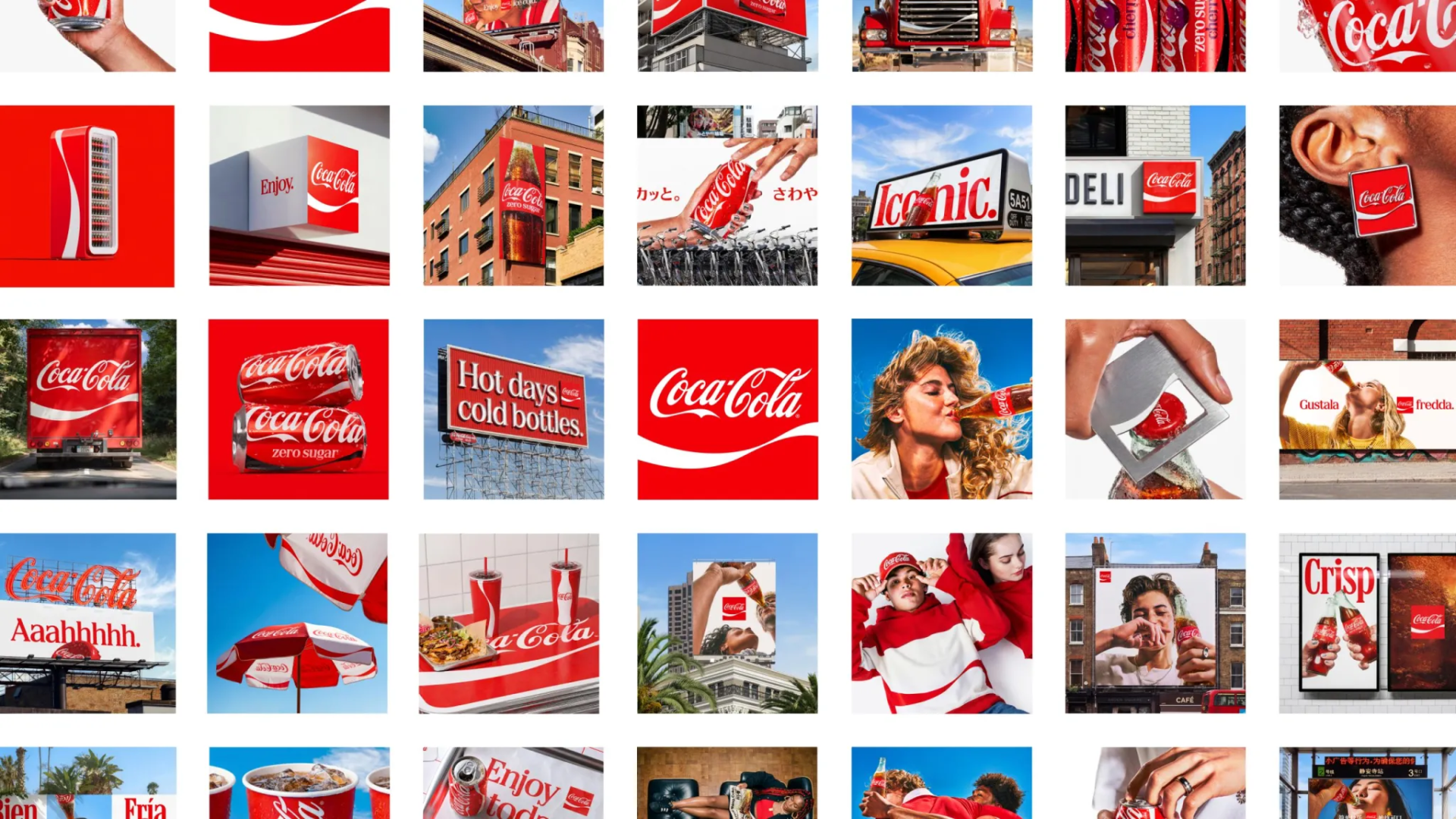
Precise graphic adjustments to modernize the lineup and improve legibility
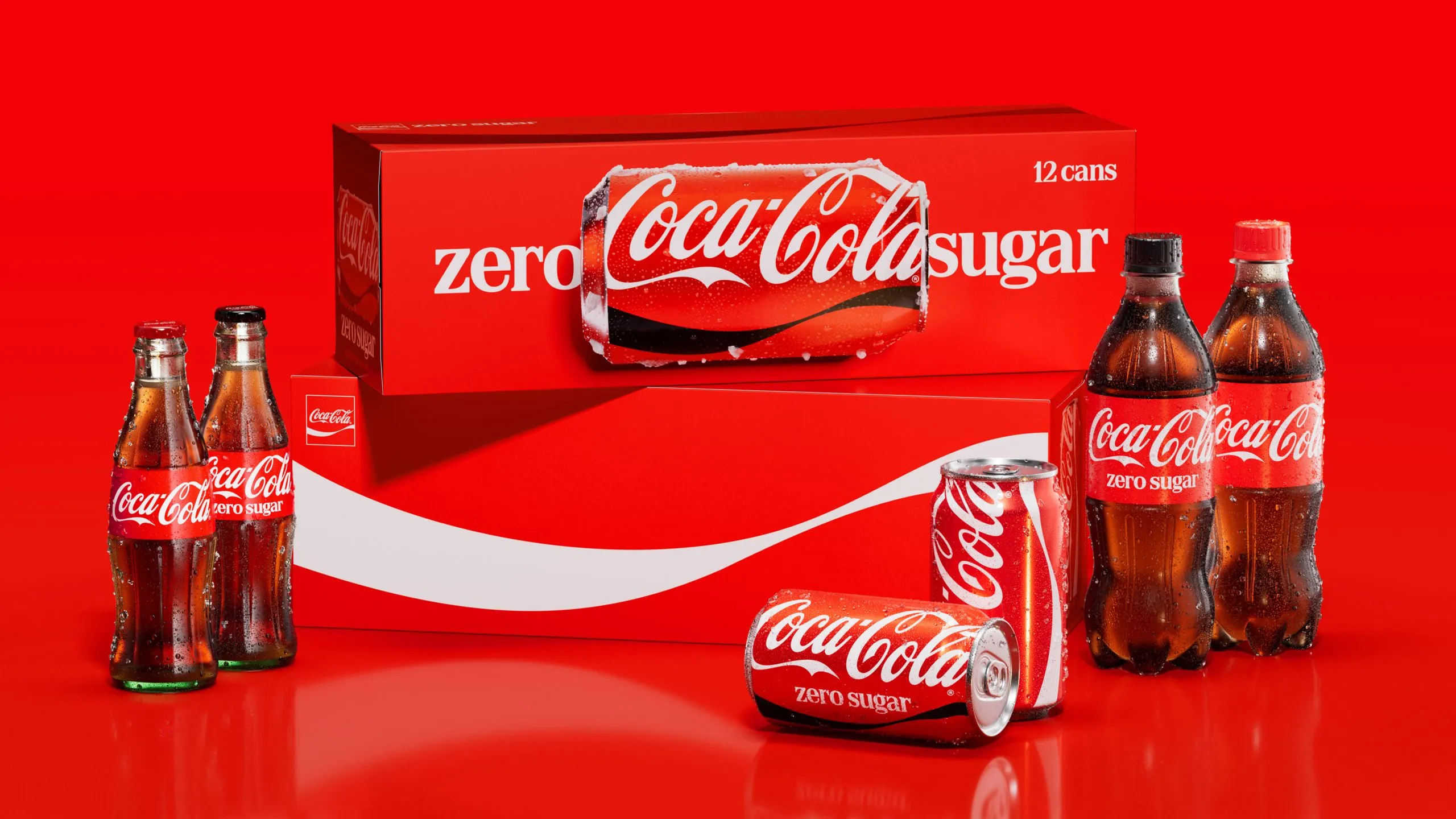
The most visible changes affect the cans, where the official typography now switches back to a vertical format. The Coca-Cola Zero Sugar range gains clarity thanks to enlarged lettering and a highly distinctive black cap. Behind the scenes, the company is deploying a digital management hub powered by artificial intelligence in partnership with Adobe. These new technological tools allow global creative teams to design perfectly consistent campaigns in every region of the world.
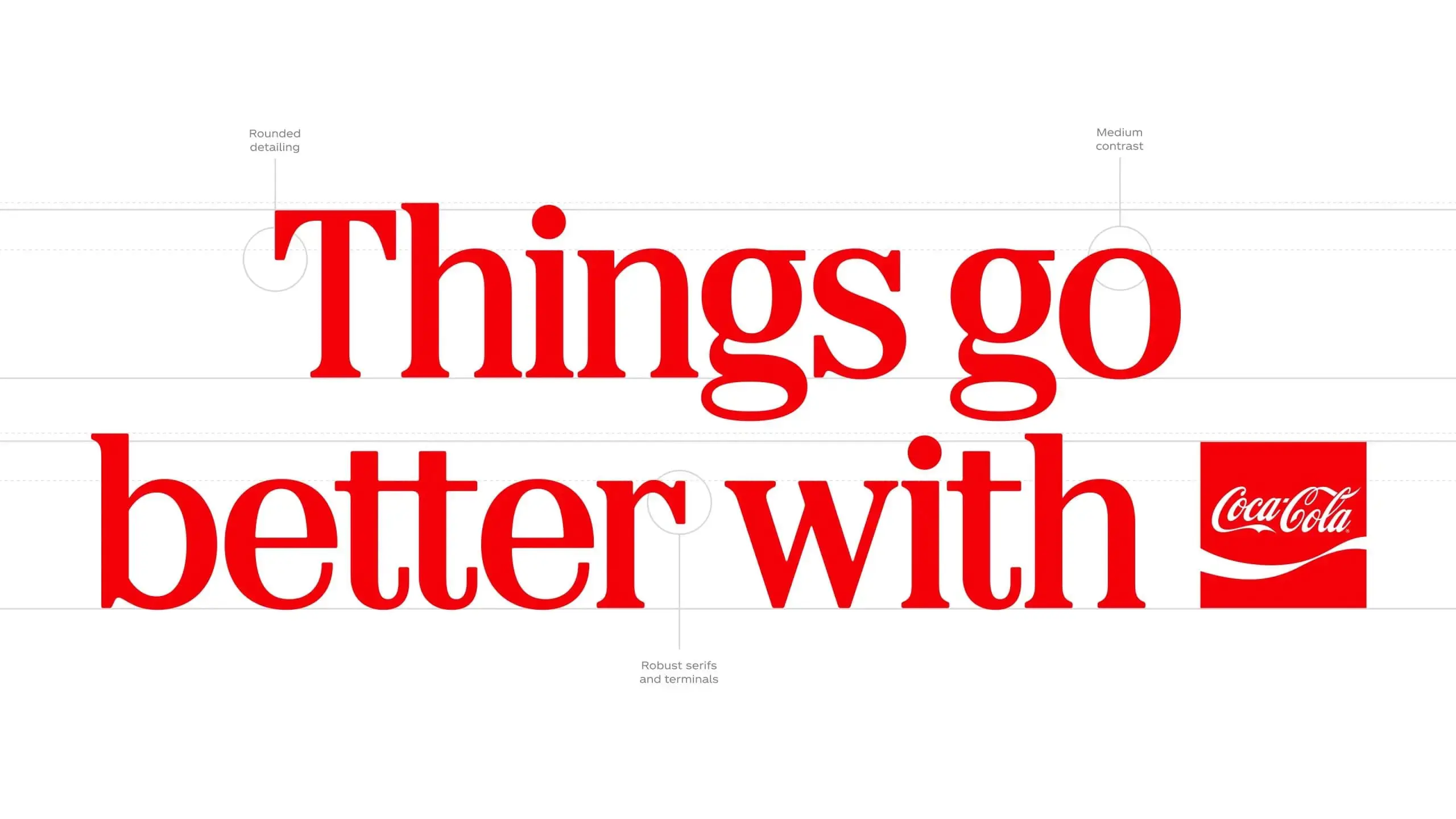
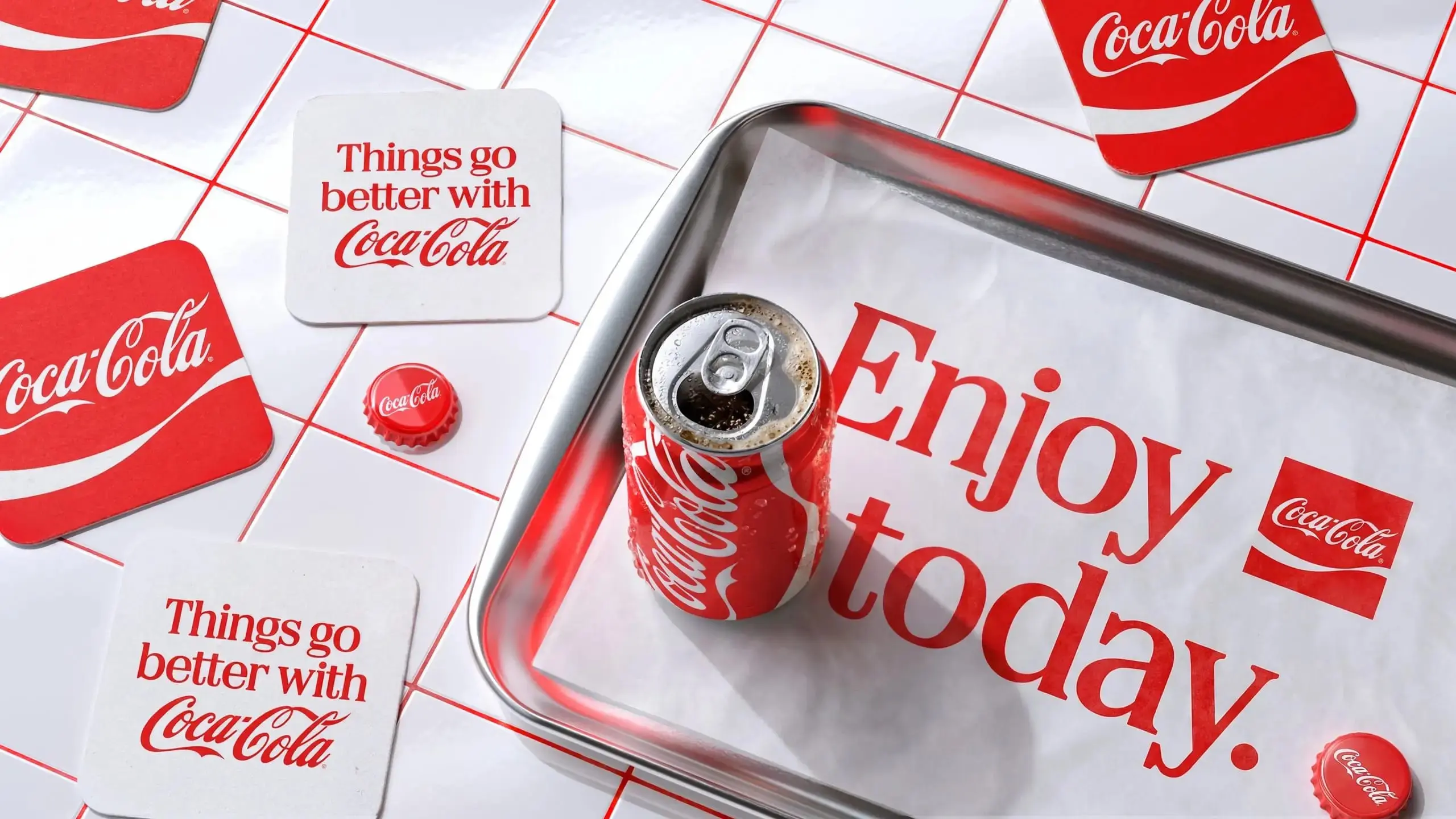
A technological infrastructure serving consistency for heritage brands
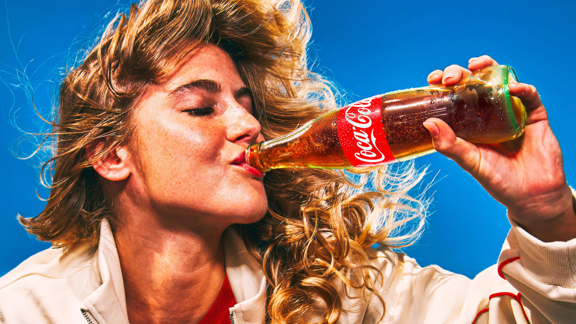
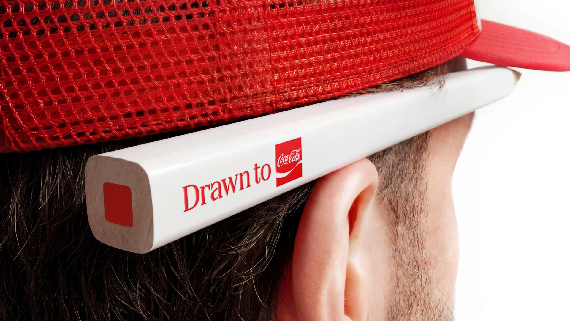
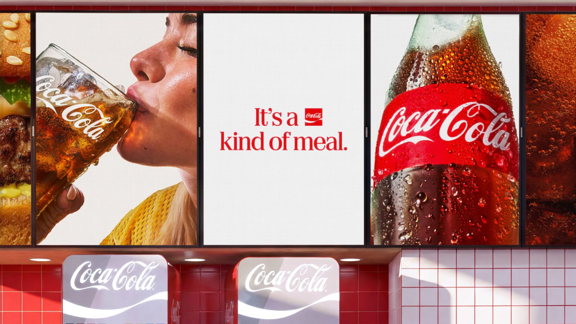
This colossal project mobilized a vast network of agencies specializing in typography, photography, and packaging. The advertising campaign Same Great Taste, New Look accompanies this rollout, which begins across Europe and the Middle East. With more than two billion drinks consumed daily, the group demonstrates how to manage a centuries-old heritage. This approach proves that combining graphic tradition with modern technology guarantees an unmatched brand presence.