Changing without betraying: that is the high-stakes challenge Lacoste has just met. More than a decade after its last update, the crocodile brand unveils a new visual identity designed with Commission studio. The goal is significant: modernizing the French house’s image for the digital era while remaining faithful to René Lacoste’s heritage. This redesign proves that a historic brand doesn’t need a revolution, but rather surgical precision.
The Return of Serif: A Stand Against “Blanding”
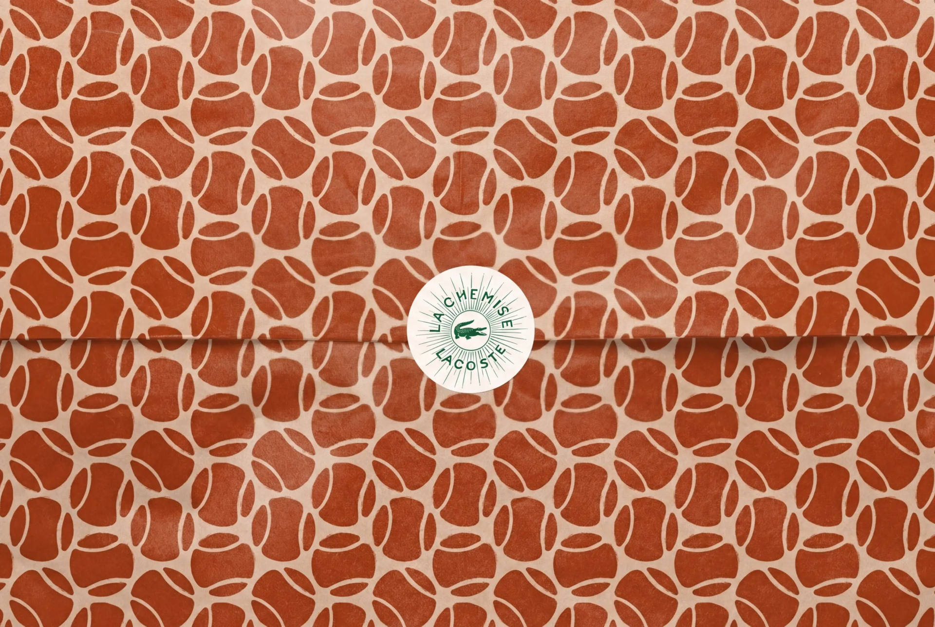
The most striking change lies in the typography. Lacoste moves away from sans-serif linearity to reintroduce serif characters, drawn directly from its archives. This custom typeface brings statutory elegance and a more assertive structure. It is a bold choice that breaks away from the “blanding” trend (excessive simplification of logos) to restore character and depth to its visual signature.
A Crocodile with Renewed Bite
The crocodile has also been refreshed. While keeping its legendary silhouette, its details have been meticulously adjusted for better expression. Its red tongue is more visible, and the iconic green has been recalibrated to match the chromatic intensity of the early days. These micro-adjustments ensure the logo remains perfectly legible, whether embroidered on a polo or displayed in miniature on a smartphone screen.
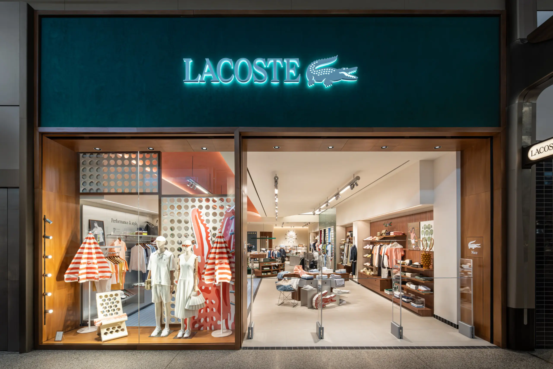
An Omnichannel Graphic Ecosystem
Beyond the logo, an entire visual language has been reimagined. From physical boutique design to digital interfaces, Lacoste now deploys total consistency. Patterns and colors interlock to create a seamless experience, capable of appealing to both tennis purists and new generations of streetwear chic enthusiasts.

This new identity is a lesson in heritage branding. By capitalizing on its fundamentals, Lacoste reaffirms its leadership in “sport-lifestyle.” The brand is not chasing fleeting trends but solidifying its foundation. The crocodile may have shed its skin, but its DNA remains intact, ready to navigate the coming decades with formidable elegance.