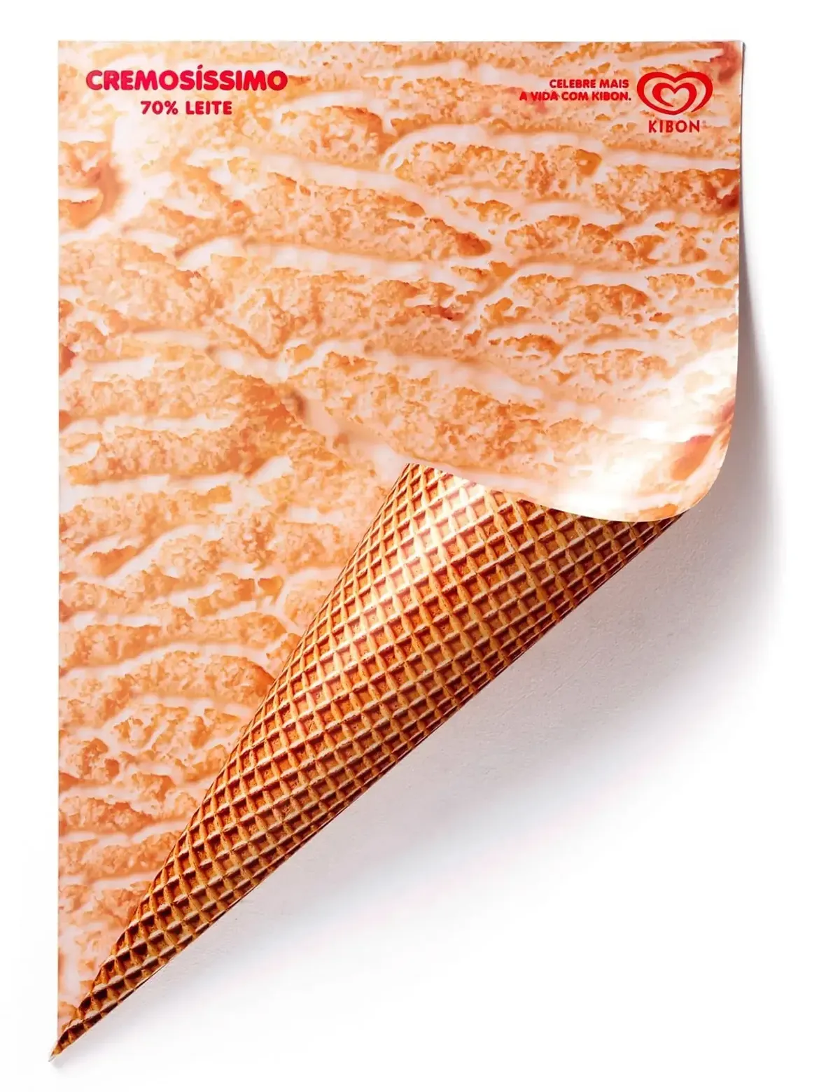
A unified global identity under the iconic red heart
The global ice‑cream giant known as Kibon, Miko or Algida depending on the country, has mastered the art of universal communication. Despite its many local names around the world, the brand maintains a single, instantly recognizable visual identity. The red heart logo connects millions of consumers from Brazil to Europe. This global presence is built on a deep understanding of local and summer consumption rituals.
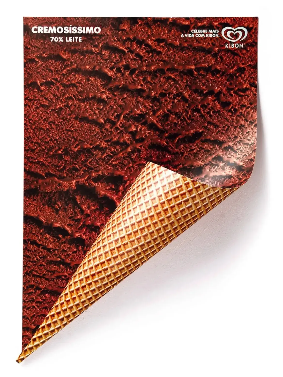
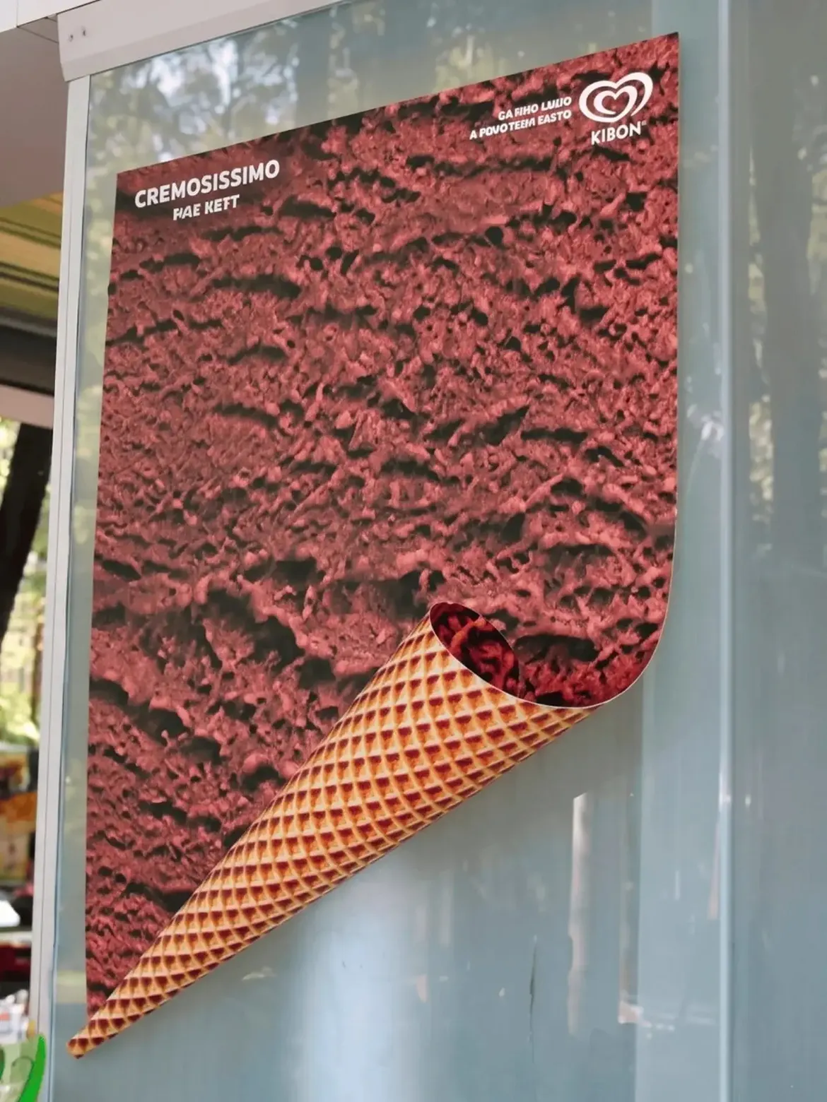
Pure conceptual clarity as a universal language
The brand’s posters prove that the greatness of an idea often lies in its absolute simplicity. By betting on a clean, minimalist design and cleverly playing with the folds of the print medium, the outdoor campaigns immediately catch the eye. A powerful concept that hijacks the paper support, a solid color background, and a simple cone illustration are enough to instantly trigger the desire for freshness. This campaign shows that brands don’t need massive media budgets to exist. A strong concept can spark conversation, travel, and amplify the brand far beyond the medium itself.
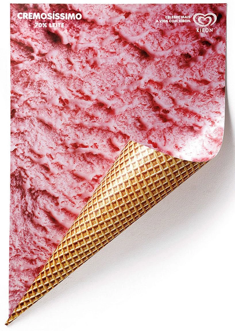

Striking effectiveness that captures attention in one second
This deliberate minimalism stands out as a particularly powerful marketing strategy to capture the fleeting attention of passers‑by and create a universal, viral campaign. The message is read and understood in a fraction of a second. By pairing the strength of the idea with an obvious indulgent promise, the brand anchors itself deeply in the collective imagination. A brilliant artistic demonstration that proves sobriety remains the key to the most memorable campaigns.