An Excellence Journey Serving Prestigious Creative Agencies.
Based in Porto, Rafael Serra stands out as an essential typeface designer. Known under the pseudonym FAEL, he perfectly masters the craftsmanship of letters. Thus, he puts his expertise at the service of prestigious international agencies. From Leo Burnett Lisboa to Young & Rubicam, his background impresses. This solid freelance experience allows him to continuously sharpen his unique eye. Consequently, he transforms technical rigor into a deeply personal artistic language.
Pop Culture Logos Used as a Visual Experimentation Laboratory.
For over a year, the Portuguese artist has used famous emblems as a lab. Indeed, he enjoys hijacking the most famous pop culture logos. His bold reinterpretations immediately capture the curiosity of branding enthusiasts worldwide. Therefore, his reputation has quickly exploded across various social media platforms. Today, his Instagram account brings together over 360,000 loyal followers. They remain fascinated by his ability to deconstruct our daily visual environment.
A Unique Aesthetic Signature Mixing Retro and Japanese Influences.
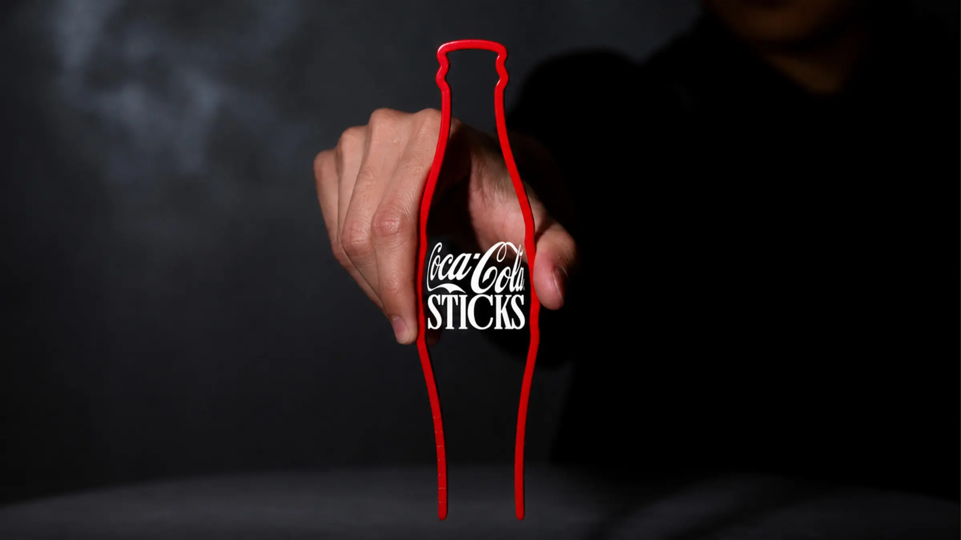
The true strength of FAEL lies in his memorable aesthetic signature. Concretely, his style offers a clever mix of retro and Japanese influences. The artist then condenses these elements into a resolutely minimalist approach. Whether reworking an institutional logotype or packaging, he simplifies everything. In this manner, he injects a nostalgic warmth into each creation. This meticulous work transforms the commercial logo into an autonomous artwork.
Global Recognition Validated by Leading Design Publications.
This technical mastery earns Rafael Serra major critical recognition across the globe. Effectively, his creations appear in numerous reference design anthologies and books. His pieces are praised in prestigious magazines such as Los Logos 8. We also find his name in Lürzer’s Archive or The Washington Post. Furthermore, platforms like Domestika and Creapills regularly feature his work. This visibility confirms that his handcrafted approach resonates worldwide.
The Power of the Perfect Character in the All-Digital Era.
In conclusion, Rafael Serra demonstrates the untouched power of calligraphic sensibility. By adopting the design codes of yesterday, he brilliantly reinvents today. His visual rewriting work offers a breath of fresh air. In fact, the contemporary advertising landscape often suffers from heavy standardization. FAEL reminds us that every great logo relies on a line. A single curve and a well-drawn character are enough.
Conclusion: The Printed Letter as a Vector of Lasting Emotion.
To sum up, Rafael Serra proves that typography remains a living art. His minimalist creations this May 2026 redefine our relationship with everyday brands. Thanks to his talent, commercial interests fade to make way for poetry. Each redesigned letter becomes a cultural bridge between different eras. Ultimately, FAEL restores the nobility of traditional graphic design. His inspiring work will surely continue to influence worldwide creatives.